Product Design - In-Vehicle Application
Enhancing the Audio App in GM Vehicles
Project Overview
The audio application in GM vehicles is one of the most used, second only to navigation, serving as the central hub for in-car entertainment. As the lead designer, I focused on enhancing features and improving the user experience for millions of drivers. One notable project required significant collaboration with internal stakeholders to address key pain points users were experiencing with the Audio app, leading to successful feature launches and improvements.
Problem
The challenge presented involved inconsistent album artwork quality, ineffective playbar control layout, confusing iconography for primary action buttons, and a visual disconnect with default artwork in the Bluetooth browsing experience.
Approach & Solution
To tackle these issues, I led a design overhaul of the audio application. My process involved deep collaboration with software teams, SMEs (Subject Matter Experts), and external partners to ensure that we not only improved functionality and useability but also maintained consistency across various displays and media sources.
Pain-points Galore
The original design intent for the Audio app was to leverage the Chevy freeform’s 17” diagonal LCD and use the space of the screen to its fullest. This inadvertently created several pain points for users throughout the audio app experience, which then became problems for me and our engineers to address. On the now playing screen, pain points included:
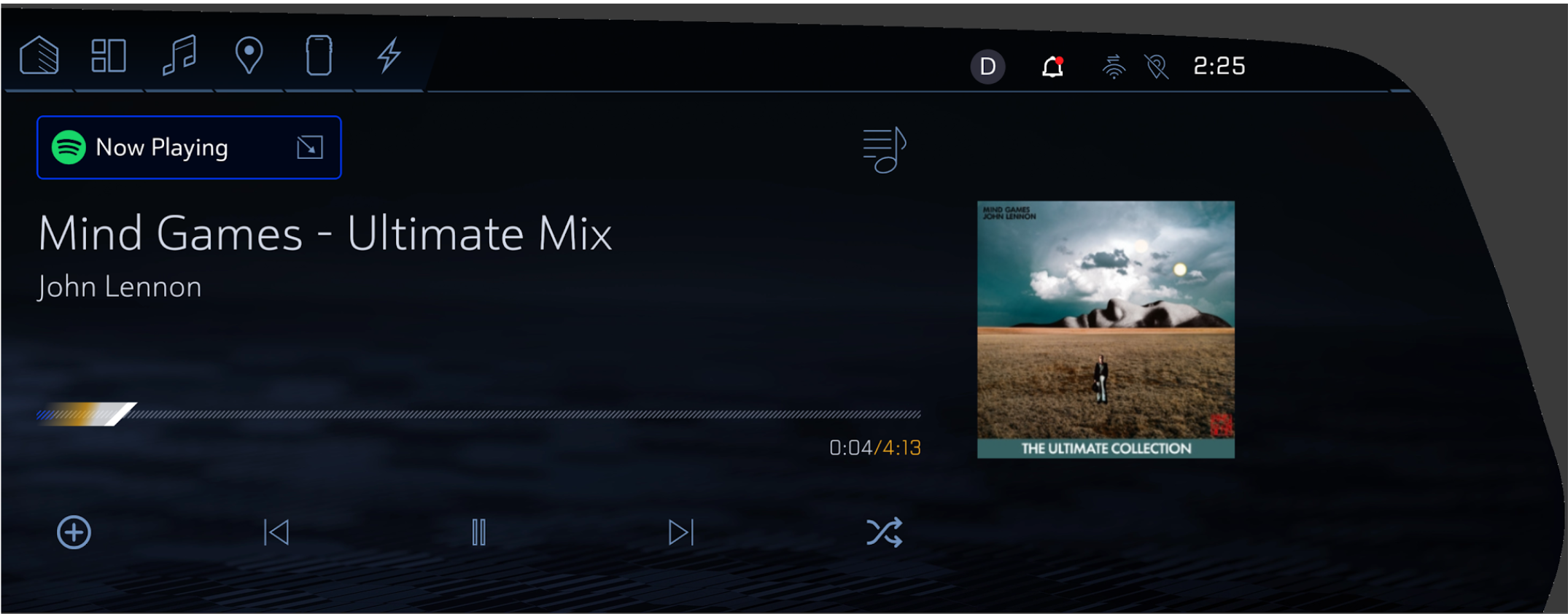
Inconsistent Album Artwork Quality: Not all media sources provided high-resolution images. With large album artwork displayed on the Now Playing screen, low-quality images appeared grainy, leading to a frustrating user experience.
A view of the previous Now-Playing Screen in the Audio App
The Now Playing screen was not the only portion of the app affected by the well intentioned design direction. The Browse screen also had its fair share of issues.
Confusing Minimized Playbar: Although the minimized playbar made good use of space, it lacked clear affordances, causing users to miss that selecting the playbar would take them to the Now Playing screen. Additionally, playback controls were limited, forcing users to navigate to the Now Playing screen for basic actions like play/pause or skip.
Similar Icons for Collapse and App Selector: The collapse and app selector buttons used similar icons, creating confusion. Users often couldn’t tell whether they were opening the source selector or collapsing the Now Playing screen.
Non-Contextual Artwork for Bluetooth Browsing: To simplify design, default album artwork was used across all Bluetooth media, leading to a disconnect for users who only saw generic music notes instead of more relevant visuals.
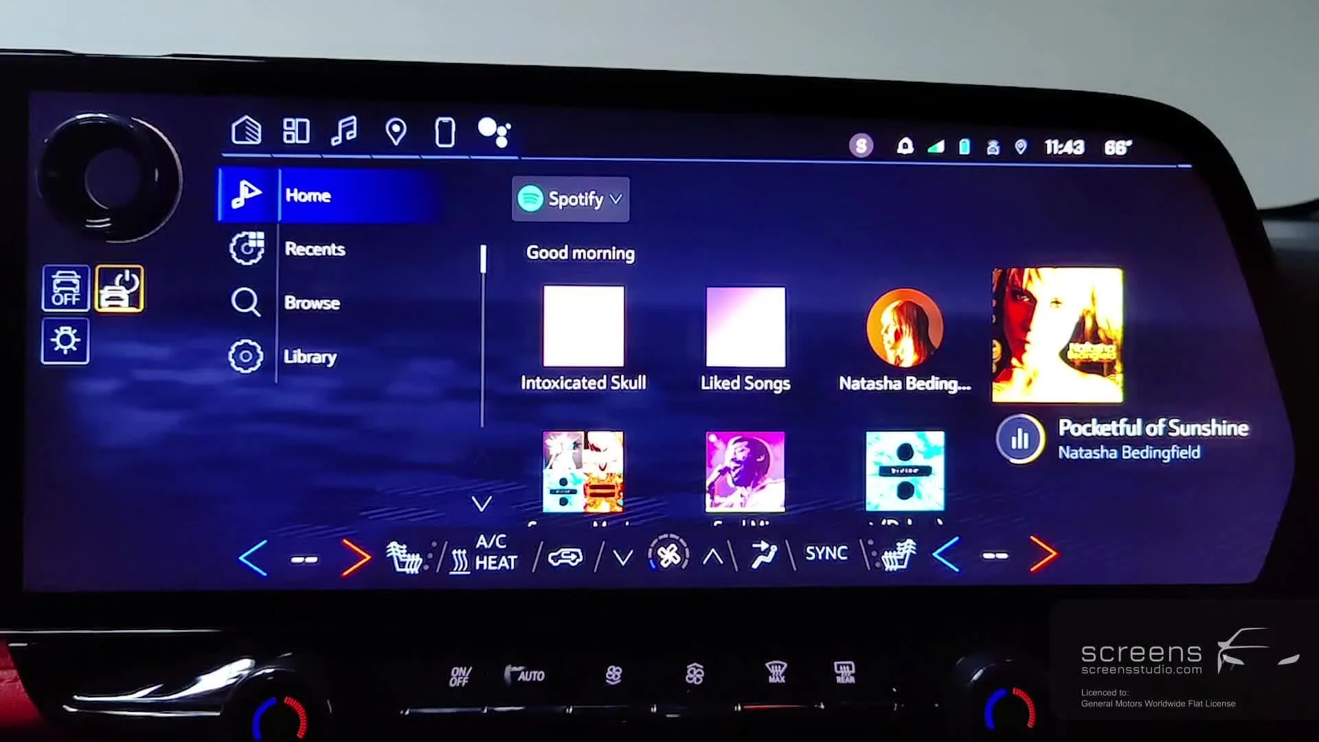
A view of the previous Audio App Browse Screen.
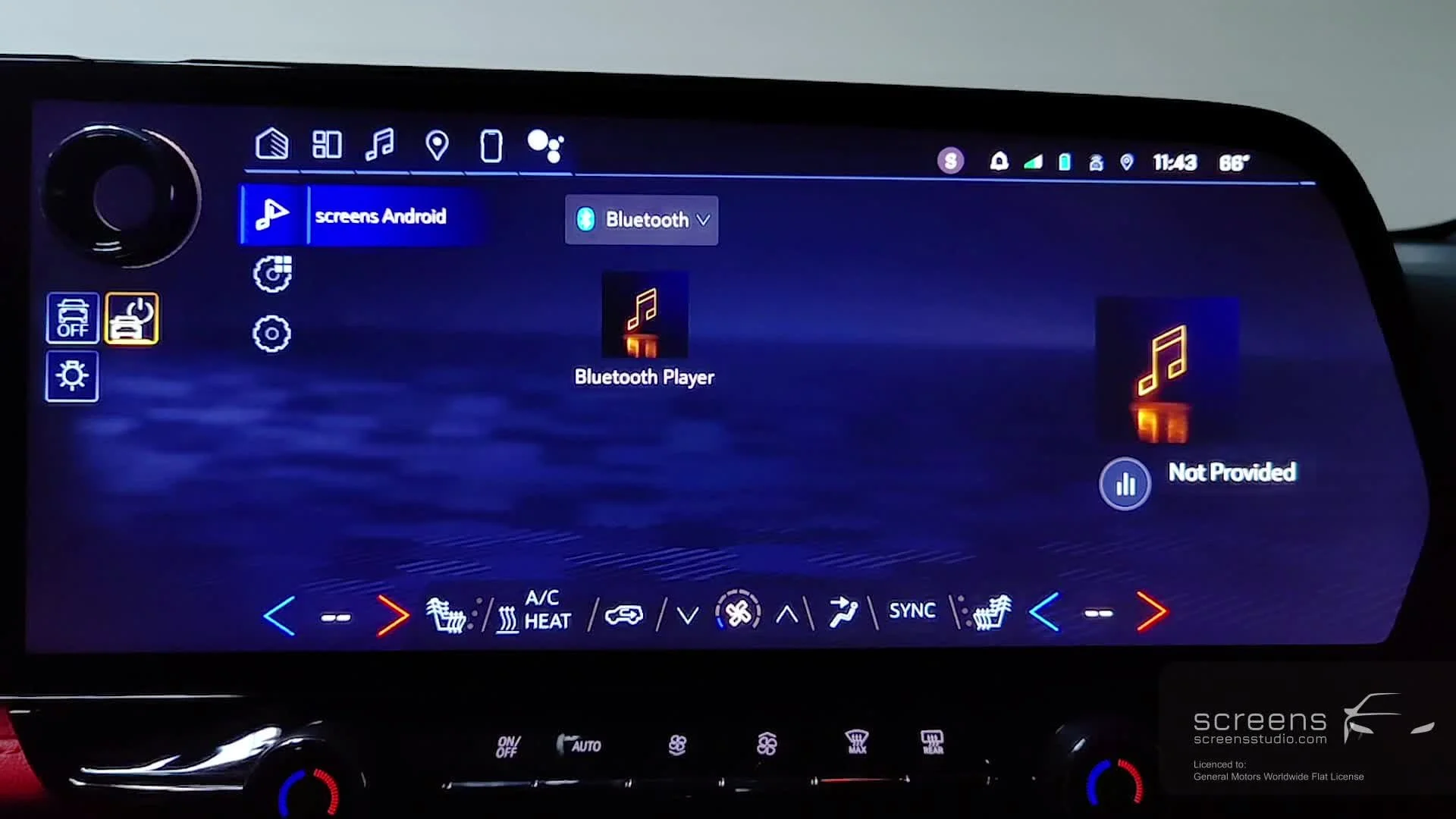
A view of the previous Audio App Browse Screen for Bluetooth.
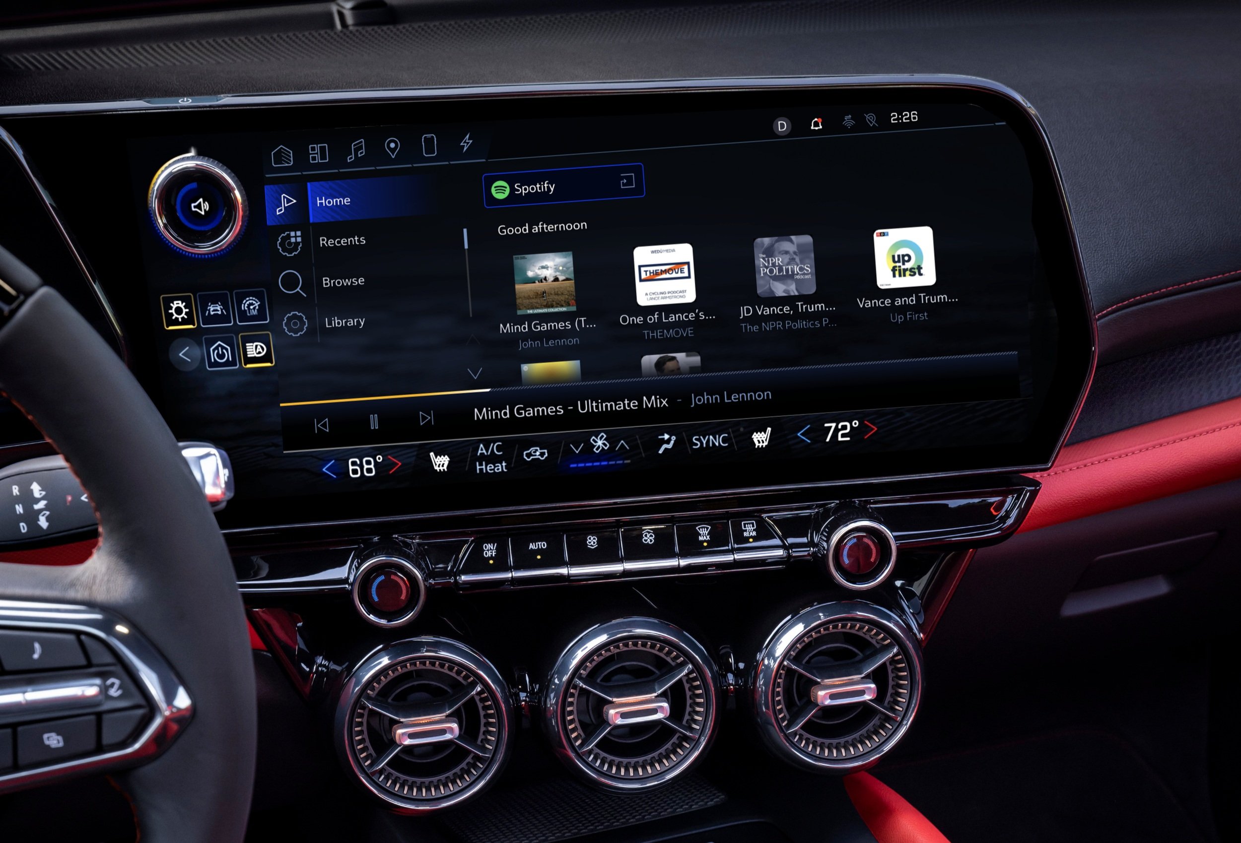
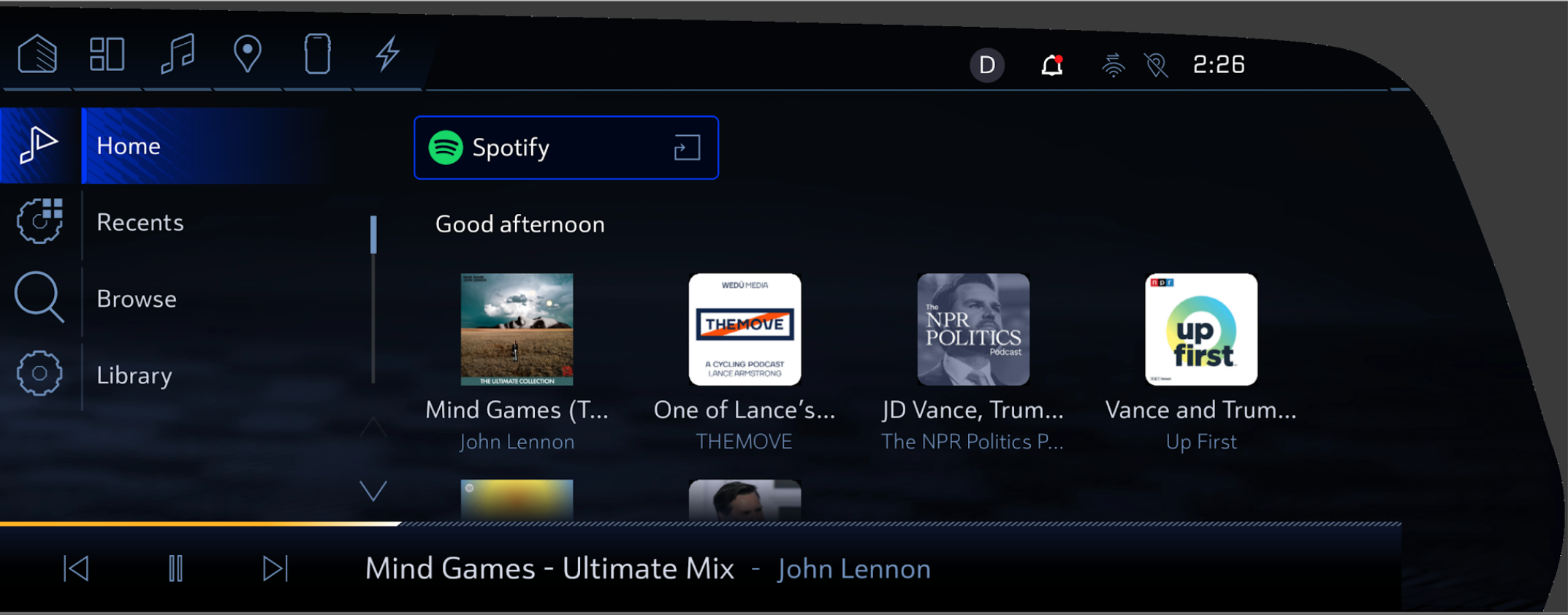
A view of the new Audio App Now Playing screen.
Key Design Solutions
To address the painpoints in the audio app, I made a number of changes. These included:
Album Artwork Resizing: I worked with the engineering team to standardize image sizes across all media sources. After researching optimal sizes, we ensured that album artwork displayed with high resolution, eliminating graininess and providing a consistent experience across applications.
Minimized Playbar Redesign: We replaced the original minimized playbar with a more traditional design, providing direct access to playback controls and offering a clearer visual cue for users to return to the Now Playing screen.
Iconography Improvements: Collaborating with the iconography team, we redesigned the collapse and app selector buttons to be visually distinct, reducing confusion and making navigation smoother.
Contextual Artwork for Bluetooth Browsing: I worked with the 3D rendering team to create contextual artwork specifically for Bluetooth browsing, replacing the generic music note with more appropriate visuals that better aligned with the user’s experience.
A view of the new Audio App Browse screen.
Outcome
The redesign resulted in significant improvements in user satisfaction and usability:
Higher Visual Quality: Users reported a more cohesive and polished experience across all media applications, thanks to consistent image rendering and improved album artwork quality.
Improved User Navigation: The traditional minimized playbar led to a reduction in user confusion and increased ease of accessing playback controls. This improved the flow between screens and reduced unnecessary steps.
Reduced Error Rates: Differentiated iconography minimized confusion between collapse and app selector buttons, leading to a decrease in mis-selections and frustration.
Reflection
This project underscored the importance of balancing aesthetics with functionality in complex systems like in-vehicle infotainment. By prioritizing user feedback, leveraging cross-team collaboration, and iterating based on real-world testing, we were able to deliver a product that enhanced the in-vehicle experience for millions of GM drivers. My experience working with hardware and software partners has strengthened my ability to navigate the technical and creative challenges inherent in designing for automotive platforms.